24.03.2020
Pure pleasure - a new look for the popular ice-cream brand
Clear, contemporary and simply yummy – this is the new look for Cremissimo at POS. The popular brand kicks off the ice-cream season with a new design and exciting new varieties. The Hamburg-based brand and design agency HAJOK designed the extensive ice-cream portfolio. In addition to the 22 existing flavours, new varieties Cremissimo Hazelnut Dream and Strawberry Yogurt have now joined the fold.
The aim of the design development was to strengthen the positive perception of the brand and to give it a new sense of self-confidence. The packaging design should emphasize the special creaminess and also appeal to younger consumers in order to strongly position Cremissimo for the future. Above all, the topic of sustainability had to be conveyed: the packs are 100% recyclable. Cremissimo is committed to closed-loop plastic recycling and this had to be clearly stated on-pack.
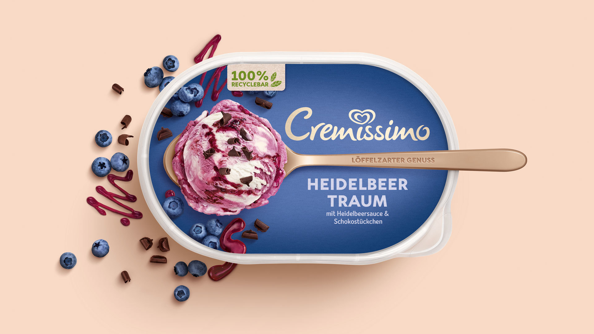
 © HAJOK: The ice cream scoop surrounded by ingredients is elaborately staged for maximum appetite appeal.
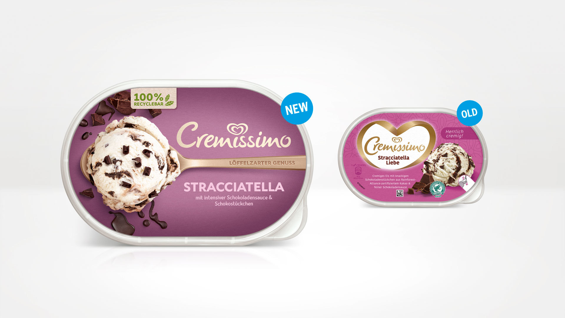
With a contemporary, trendy design, HAJOK has put Cremissimo in a completely new light. The logo has been simplified and modernised. The lettering has been removed from the heart-shaped imagery and now interacts with the spoon as a new key visual, placing the soft, spoonable creaminess at the centre of the design. The previously rather artificial colour scheme has given way to a rich range of colours. The sustainability of the pack has gained prominence with a paper-look flash and illustrations. The Cremissimo portfolio appeals with a contemporary, distinct visual identity, providing more stand-out effect to help quickly find your favourite variety, while really making you want to enjoy some super-smooth ice-cream!
 © HAJOK: The new design dispenses with the prominent Cremissimo heart. Instead it uses the spoon as a key visual, to convey the special creaminess of the product.


